
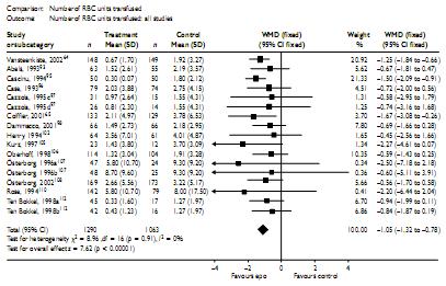
This "blobbogram" (sometimes called a forest plot) is taken from Wilson et al, Health Technology Assessment, 11(13), a meta-analysis of erythropoetin (EPO) for anaemia in cancer.
The vertical line down the centre of the plot is the line of no difference. The outcome is mean difference (referred to here as weighted mean difference, WMD) and so the line of no difference is at zero. The outcome is units of red blood cells transfused, and results less than zero favour EPO.
Each horizontal line on the plot represents the results of the trial listed next to it in the left-hand column. The "blob" in the middle of the line represents the estimate from the trial and lines extend to the 95% confidence intervals (95%CIs). You will sometimes see the RR, OR or HR plotted on a log-scale so that the plot look symmetrical (lnRR, lnOR and lnHR are normally distributed). If there are two tick marks at the ends of the lines, these would usually indicate the 95% and 99% CIs.
The size of the blobs indicates the amount of weight each trial has in the pooled result. This is not strictly necessary as similar information is contained in the width of the CIs. Visually blobs are better because they draw the eye to the trials which give the most information, whereas the width of the confidence intervals tends to focus the eye on the smaller trials with the widest lines.
The centre of the diamond at the bottom represents the pooled estimate, and extends to (usually) the 95% CI for the pooled estimate. The plot will often also contain a p-value for each trial and the pooled result (test "test for overall effect" at the bottom left), and (as in this case) may list the weights, estimates and CIs in numbers alongside the graphic.
Question:
Can you see anything wrong with the plot above?
Answer:
The blobs are not sized correctly (the software used to produce these plots seems to have problems when there are too many trials).
The first and third trials above, for example, have much tighter confidence intervals than the rest. According to the weight(%) column, they each have over 20% weight in the analysis. They should have boxes a lot larger than the rest of the trials in the plot.