
Introduction
Learning objectives: You will learn about dot-plots, histograms, box-whisker plots, and scatter plots.
A picture is worth a thousand words or numbers, and there is no better way of getting a "feel" for the data than to display them in a figure or graph. The general principle should be to convey as much information as possible in the figure, with the constraint that readers are not overwhelmed by too much detail. Further details are given in Freeman, Walters and Campbell (2007). A chart should also be self-contained. Although details regarding what it shows may be described in accompanying text, information such as subject, years covered, and source of information should be self-evident from the chart itself. Axes also need to be labelled clearly, staggered axes should be indicated and scales should be appropriately chosen.
Please now read the resource text below.
Resource text
Dot Plots
The simplest method of conveying as much information as possible is to show all of the data and this can be conveniently carried out using a dot plot.
Example 1
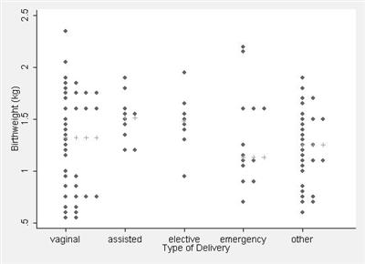
Data on birth weight and type of delivery are shown in figure 1 as a dot plot. This method of presentation retains the individual subject values and clearly demonstrates differences between the groups in a readily appreciated manner. An additional advantage is that any outliers will be detected by such a plot. However, such presentation is not usually practical with large numbers of subjects in each group because the dots will obscure the details of the distribution.
Figure 1: Dot plot showing birth weight of 98 babies by type of delivery with the medians shown by "+" (data from Simpson, 2004)
Histograms
The patterns may be revealed in a large dataset of a numerically continuous variable by forming a histogram. This is constructed by first dividing up the range of the variable into several non-overlapping and equal intervals, classes or bins, then counting the number of observations in each. A histogram for all the 98 birth weights in the Simpson (2004) data is shown in figure 2. The area of each histogram block is proportional to the number of subjects in the particular birth weight category group. Thus the total area in the histogram blocks represents the total number of volunteers. Relative frequency histograms allow comparison between histograms made up of different numbers of observations, which may be useful when studies are compared.
Figure 2: Histogram of birth weight of 98 babies (data from Simpson, 2004)
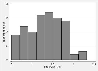
The choice of the number of intervals is important. Too few intervals and much important information may be smoothed out; too many intervals and the underlying shape will be obscured by a mass of confusing detail. It is usual to choose between 5 and 15 intervals, but the correct choice will be based partly on a subjective impression of the resulting histogram. Histograms with bins of unequal interval length can be constructed but they are usually best avoided (if unequal interval widths are used, the heights of the bars will need to be adjusted since area is proportional to frequency). Note that a histogram should always indicate the sample size, and that there should be no gaps between the bars.
Box-whisker plots
If the number of points is large, a dot plot can be replaced by a box-whisker plot which is more compact than the corresponding histogram. Such a plot is illustrated in figure 3 for the birth weight and type of delivery from Simpson (2004).
Figure 3: Box-Whisker plot of birth weight of babies by method of delivery (data from Simpson, 2004)
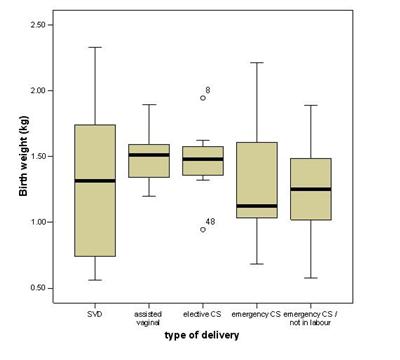
The median value is indicated by the central horizontal line, and the lower and upper quartiles by the corresponding horizontal ends of the box. The "whiskers" in the diagram indicate the usual range of the data. Suppose the length of the box is b. Then the lower whisker extends up to 1.5b from the lower quartile and the upper whisker extends up to 1.5b from the upper quartile. If the minimum and maximum values of the variable under consideration are within this range, the whiskers stop at these values. Otherwise the extreme points are indicated by dots. Thus, in figure 3 we can see that there were two outlying points for the elective caesarean section group, for subject number 8 and subject number 48. For the other groups, the whiskers indicate the maximum and minimum values. The box-whisker plot, as used here, therefore displays the median and two measures of spread, namely the range and interquartile range.
Scatterplots
When you wish to show a relationship between two continuous variables then figure 4 shows a scatterplot of birth weight by maternal age from Simpson (2004).
Figure 4: Scatterplot of birth weight by maternal age (Simpson, 2004)
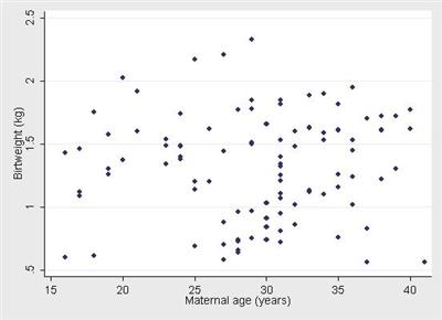
In general, you should choose the axes to reflect the full range of the data. If one variable x clearly causes the other y, then it is usual to plot the x variable on the horizontal axis and the y variable on the vertical axis. Thus, if a drug is given in various dosages, the dosages would be along the x -axis and the response measure on the y -axis.
References
- Freeman JV, Walters SJ and Campbell MJ. How to Display Data. Oxford: Blackwell BMJBooks 2007.
Simpson A. PhD Thesis Institute of Primary Care, University of Sheffield, 2004.