
Understanding populations over time
Whilst births, deaths and migrations form important building blocks for understanding populations, Omran[1], in his theory of epidemiologic transition, described many other factors impacting on population change. His theory focuses on the complex change in patterns of health and disease and the importance of socioeconomic, political and cultural determinants such as standards of living, hygiene and nutrition. Omran describes the decline of infectious diseases in western Europe, the improvement in health outcomes for women and infants, improved life expectancy and gradual increase in cancer and cardiovascular diseases. Japan fits into the 'Accelerated Epidemiologic Transition Model' and developing countries fit into the 'Delayed Epidemiologic Transition Model'.
More than 30 years since his theory was first published, many regions are not fitting neatly into Omran's theory. Many low and middle income countries are suffering the double burden of high mortality from infectious diseases as well as emerging epidemics of non-communicable diseases, particularly in urban areas. Russia is experiencing extremely high levels of alcohol related mortality amongst working age men. The increase in childhood obesity in the UK and USA has led to the danger of children having, for the first time, a shorter life expectancy than their parents.
International differences in respect of mortality
To understand the impact of mortality on a population both numerator, i.e. the number of deaths and the denominator, the population of interest, are needed.
Registration of cause of death exists in approximately 70 countries, but comparing death rates across countries needs to be done with caution. In India and China sentinel surveillance systems cover some parts of the population. In other low and middle income countries, registration systems are poorly developed, and surveys are used.
The Global burden of Disease Study[2] http://www.healthdata.org/gbd [accessed 01/10/2018].
As at 2015 the data capture premature death and disability from more than 300 diseases and injuries in 188 countries, by age and sex, from 1990 to the present, allowing comparisons over time, across age groups, and among populations.
Death certificates provide space for multiple causes. Summary statistics, reporting a single cause, aim to identify the 'underlying cause of death'. There are, however, a number of weaknesses, for example:
- Even in western European countries, diagnosis is inexact and open to disagreements.
- It is hard to gauge trends in death rates over time as ICD versions change - although bridging tables do exist.
International differences on a range of indicators
The World Health Report (WHR) is a series of reports produced regularly by the World Health Organisation (WHO). First published in 1995, the World Health Report is WHO's leading publication.[1] Published annually or biennially in multiple languages, each report includes an expert assessment of a specific global health topic, relating to all countries that are Member States of the organisation. [2]
The main purpose of the WHR is to provide policymakers, donor agencies, international organisations and others with the information they need to help them make appropriate health policy and funding decisions. However, the report is also accessible to a wider audience, such as universities, journalists and the public at large. It is expected that anyone, with a professional or personal interest in international health issues, will be able to read and take use of it.
https://en.wikipedia.org/wiki/World_Health_Report [accessed 07/01/2016]
http://www.who.int/whr/previous/en/
http://portal.euro.who.int/en/?
International differences in life expectancy[3]
Data from the World Health Reports has been presented as an interactive map
http://gamapserver.who.int/gho/interactive_charts/mbd/life_expectancy/atlas.html [accessed 01/10/2018]
Stark inequalities are evident. While Japan had the highest Life expectancy at birth (LEB), with an average of 84 years, Sierra Leone had an average of just 46 years. In general LEB figures are highest in Canada, Western Europe, Australasia and Japan and lowest in sub-Saharan Africa. Within all of these countries there are also internal disparities between rich and poor.
International differences in life expectancy over time3
Global life expectancy improved significantly during the Twentieth Century, especially in developed countries. Life expectancy at birth in the UK was 47 years in 1901[5]. At the end of the century it was 77.5 years, an increase of over 64 per cent[3]. These gains were due largely to the eradication and control of numerous infectious diseases and to advances in agricultural technologies such as chemical fertilisers. These increases, however, have not been universal. Due to the effects of HIV/AIDS life expectancy has declined in many sub-Saharan African countries. According to the United Nations, average LEB in sub-Saharan Africa was 46 years in 2006, lower than it had been 30 years previously?
http://www.un.org/apps/news/story.asp?NewsID=20548 [accessed 07/01/2016]
Similarly, after the break-up of the Soviet Union in 1989, male life expectancy in Russia dropped by 6 years from 65 years in 1989 to 59 in 2005.
International differences in age structure[4]
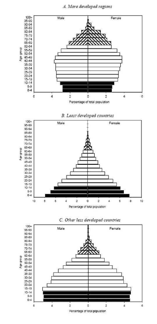
The three charts above show that the more developed regions, least developed countries, and other less developed countries present distinctive age profiles.
Chart A above shows how more developed regions have much higher proportions of older persons than the two groups of countries from the less developed regions. Whereas the least developed countries clearly show the legacy of high fertility, whose wide bases testifies to the relatively high crude birth rates found in these countries.
Regional differences in respect of age
Deep divisions exist between the English regions and between parts of the UK. London is not only the economic powerhouse of the country, generating one-fifth of the country’s output, but it is also the youngest part of the UK, with a median age of 34 years compared with just under 40 for the nation as a whole.
In the south-west we can expect to see a higher median of age (42.9 years) than compared to the rest of the UK.
https://www.ons.gov.uk/peoplepopulationandcommunity/populationandmigration/populationestimates/bulletins/annualmidyearpopulationestimates/mid2012tomid2016 [accessed 22/06/2018].
The rise in sexually transmitted infections is predominantly affecting younger people. Indications of public health in the English regions: sexual health http://fingertips.phe.org.uk/profile/sexualhealth/data#page/0 [accessed 07/01/2016].
Regional differences in ethnicity
Indications of public health in the English regions: ethnicity and health
http://www.lho.org.uk/viewResource.aspx?id=9840 [accessed 07/01/2016].
Regional Differences in social class
Widening inequalities in obesity by social class and geographical prevalence National Obesity Observatory
http://webarchive.nationalarchives.gov.uk/20170110165409/https://www.noo.org.uk/visualisation [accessed 07/01/2016].
Office of Population Censuses and Surveys (OPCS) longitudinal study identified a 1% sample of the 1971 Census and follows them until death. This study contains linked census and life events data and can be used to study inequalities in health and the effects of wider social determinants such as housing tenure.
https://www.ons.gov.uk/aboutus/whatwedo/paidservices/longitudinalstudyls
The Whitehall cohort studies of British civil servants found marked inequalities in health and mortality by employment grade
https://en.wikipedia.org/wiki/Whitehall_Study [accessed 07/01/2016].
Also see ‘Chapter 4c Equality, Equity and Policy’
Regional differences in life expectancy
Whilst life expectancy is increasing overall in England, there is a distinct 'north/south' divide for life expectancy at birth. In all regions from the Midlands northwards, female life expectancy is significantly shorter than in the regions to the south. The difference is around one year of life. For men in the north, life expectancy at birth is around two years shorter than for men in the south[5].
Differences exist within regions also. Dorling analysed the 32 stops of the Central Line to illustrate the extent and impact of inequality in Britain today.
http://www.dannydorling.org/books/centralline/Figures_and_Data.html [accessed 07/01/2106]
References
1 Omran, AR The Epidemiologic Transition: A Theory of the Epidemiology of Population Change.'
Milbank Memorial Fund Quarterly 49 (Oct 1971): 509-538
2 http://www.who.int/healthinfo/bodproject/en/index.html [accessed 30/11/2007].
3 http://www.esrc.ac.uk/ESRCInfoCentre/facts [accessed 30/11/2007].
4 United Nations Department of Economic and Social Affairs/Population Division 23 World Population Prospects:
The 2004 Revision, Volume III: Analytical Report http://www.un.org/esa/population/publications [accessed 30/11/2007].
5 Health profile of England, Department of Health, 2006 http://www.dh.gov.uk/en/Publicationsandstatistics
[accessed 30/11/2007].
© M Goodyear & N Malhotra, 2007, M Goodyear 2016 and S Seager 2018